Creating a shared Design System after a merger
Timeline
2023 June - October
My role
UX/UI Designer responsible for system analysis, component standardization, and building a unified design framework.
Team
Product designers, front-end developers, and stakeholders from both organizations.
1. Introduction
Project Overview
After a merger between two tech companies, the challenge was to unify their existing design systems to create a cohesive design foundation. Both systems supported customization but used different approaches, levels of complexity, and naming conventions. The goal was to establish a shared design language and framework that could harmonize the companies' products, ensuring consistency, scalability, and accessibility.
How can two distinct design systems be combined into a unified system that supports customization, enhances scalability, and maintains the integrity of diverse product use cases?
Objective
Create a unified design system that:
Establishes a shared foundation for colors, typography, and sizing.
Streamlines components and patterns while respecting existing use cases.
Promotes accessibility and a seamless user experience across all products.
Developement plan

2. Research & Discovery
Understanding the Existing Systems
We began with a comprehensive audit of both design systems to understand their:
Customization models (e.g., approach to overrides or theming).
Component libraries (depth, breadth, and naming conventions).
Pattern libraries (navigation, feedback, and accessibility principles).
Stakeholder Workshops
Collaborated with designers, developers, and product managers from both companies to:
Identify pain points with the current systems.
Define requirements for the unified system.
Gather insights on critical use cases for components and patterns.
3. Strategy & Approach
Unifying the Foundations
Before tackling components, we needed to address fundamental inconsistencies.
Color System: Created a shared color palette by analyzing usage patterns and consolidating colors into a scalable system with primary, secondary, and neutral tones.
Typography: Developed a common type scale
Sizing: Standardized spacing and sizing scales to ensure consistency.

These tables display the basic size tokens used by the design system for all its measurements. Additional size-type tokens build upon these, including those for radiuses, line heights, and more.

These are the typography tokens, which are based on the basic size tokens.
You can read about the color tokens and the challenges faced in defining them in this other case study:

Component Harmonization
Mapped out all components from both systems.
Gathered use cases for each component to understand variations and requirements.
Reviewed how each component was used across products.
Created a unified requirement list for each component to ensure consistency.
Ensured the new requirements wouldn’t disrupt the functionality of existing products.
Took into account any stronger requirements from either side to preserve product integrity.
Established clear and scalable naming conventions based on industry best practices.

As an example of this excersise here is the analysis of the Radio button list component, showcasing its functionality, design, and usability considerations.
Defining Common Patterns
Although only one of the design systems had an explicit list of patterns for elements like navigation, tone of voice, communication, etc., these patterns also existed in the other system, just not documented. By making note of them and discussing real examples during workshops, we were able to align on a shared understanding and refine these patterns as we laid the foundation for the new design system.
Navigation: Unified principles for user flows, menus, and page layouts.
Accessibility: Made sure components and interactions followed WCAG standards, including colour contrast and keyboard operability.
Feedback: Established clear, consistent protocol for error states, validations, and system notifications.

Exploration of how navigation is organised across products to identify common patterns differences.
4. Design
Component Library
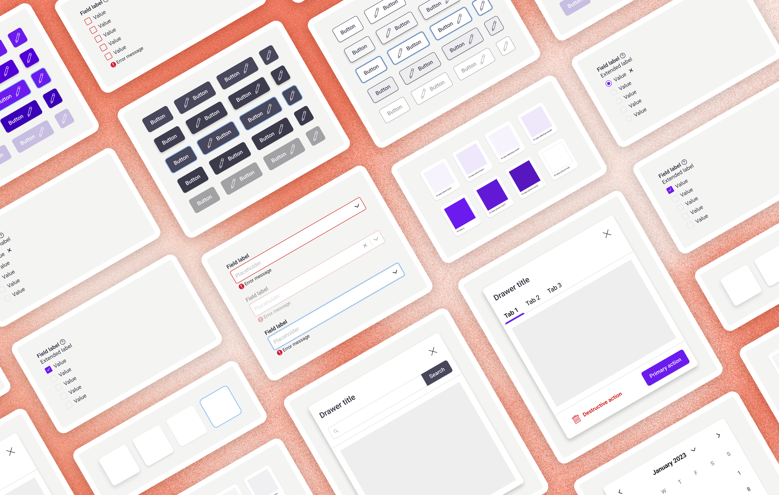
When the requirements were laid out, we could start to design a cohesive component library using a modular approach, ensuring reusability and scalability across different products. This process included:
Standardization of Components – Unified existing components from both design systems, resolving inconsistencies in naming conventions, functionality, and styling.
Variants & States – Defined a comprehensive set of states (default, hover, active, disabled, error, etc.) and variants to support diverse use cases.
Token Integration – Implemented the new colour, spacing, and typography tokens to maintain consistency.
Accessibility Compliance – Ensured all components met WCAG standards, incorporating focus states and keyboard navigation.

Example of Select Control Variants: Showcasing the range of states and configurations designed for all form controls.
Prototyping & Testing
To validate the new system, we:
Created interactive prototypes to test real-world usage.
Conducted usability tests with designers and developers to refine interactions.
Worked closely with engineers to address technical feasibility and implementation constraints.
PatternsAccessibilityBreadcrumbDrag and DropEmpty StateFeedbackLoadingModalityNavigation
FoundationsBorderColourElevationIconLayoutRadiusSpacing
ComponentsAccordionAvatarBarButtonCardCheckbox listDate PickerDialogueDrawerDropdown ListFile UploadLinkListLozengeModalMultiple Selection FieldPaginationRadio Button ListSliderTabTableText AreaText FieldToggleToast NotificationTooltip
A complete overview of all the elements in the design system.
Documentation
Developed comprehensive design system documentation including:
Figma files organized by token, component, and page template levels.
An internal website showcasing demo versions of the components with descriptions, interaction patterns, and best practice guidelines.
5. Impact & Results
Key Outcomes
Unfortunately, I left the company before the full impact of the project could be realized. However, it was already clear during the design phase and workshops that this initiative was not only beneficial but essential for unifying the products of the two companies, allowing them to work seamlessly together.
Improved Efficiency: Designer had already started using the new design system and reported that it helped them create designs aligned with both companies' design standards.
Scalability: The unified system supported new product development and customization requests with ease.
6. Lessons learned
Cross-team collaboration was essential for aligning priorities and resolving conflicts.
Setting stricter requirements for the components made the system more robust, but it also meant we had to communicate carefully to get everyone on board.
This project was a great opportunity for the design teams to get to know each other's work styles and practices, promoting learning and knowledge sharing across teams.


