Color Tokens for white label design system
Timeline
2023 June - October
My role
UI Designer, implementation support and handoff
Team
UI Designer, 1 developer, 1 Product manager
Introduction
In this project, our aim was to develop colour tokens for a new design system developed after a recent merger. Our goal was to build a shared design foundation that would unify the design systems from both companies, supporting two separate product ecosystems and meeting each of their specific needs.

One specific requirement from our side was for the colour token system to be compatible with the Theme Editor, a tool that enables users to quickly generate themes using a few key colours. We needed to create a flexible and scalable solution that worked well with this existing feature.

The user defines the key colours in the theme editor. Based on these key colours colour scales are generated.

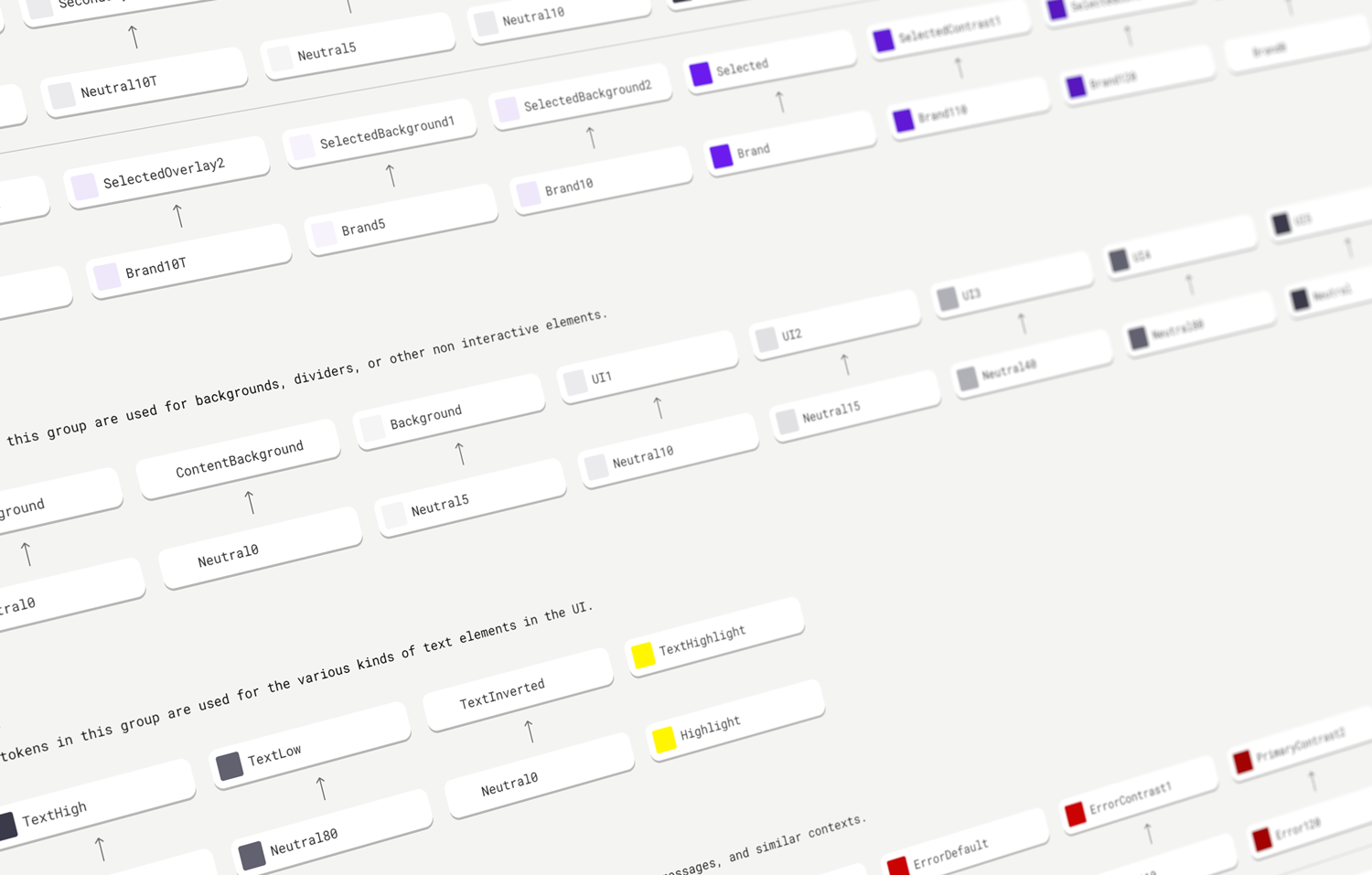
Colour Token Structure:
First Level Tokens:
Represent every step on the generated colour scale.
Not all tokens are utilized in the subsequent levels.
Second Level Tokens:
Grouped into semantic categories.
Reference tokens from the first level.
Groups may overlap, for example, the 'Selected' and 'Primary' groups might reference first-level tokens derived from the same key colour.
Third Level Tokens:
Component-specific tokens.
Reference tokens from the second level.

Customization Levels:
Basic Customization: For customers without specific customization needs, branding can be quickly set up using the Theme Editor.
Intermediate Customization: For minor, isolated changes, entire colour groups can be assigned a new key colour, generating a corresponding colour scale. This approach ensures consistent updates across the group without adjusting each token individually, preserving the relationships between values in the group.
Advanced Customization: For customers requiring maximum control, component-specific tokens can be directly adjusted to ensure the UI aligns precisely with their brand guidelines.

Accessibility Considerations:
The colour token system was built with accessibility in mind. For instance, in the case of a primary button, the label colour is automatically chosen based on the key colour to ensure high contrast against its background.